Introduction to GIMP - Basic image treatment
When it comes to image manipulation, the first software that comes to mind surely is Photoshop. Nevertheless, we can also think of GIMP, a free open source solution that is suitable for the majority of common tasks.
Here we’re going to look into some of the basic features that can make our lives much easier, and solve most everyday situations. GIMP can be downloaded free of charge here, with versions for Linux, OS X or Windows. If you have some experience with Photoshop, you may want to tweak the interface to something you’re more familiar with. Several tutorials exist for this. A rather exhaustive one can be found here.
Among all the possible interface tweaks, the first thing that really makes our lives easier is to set GIMP to work in single-window mode. To do this, in the GIMP menu, go to “Windows” and then select “Single-Window mode”.
A small warning
Before starting to really work on images, a small disclaimer : when handling scientific images, we need to be really careful not to modify our data! To increase contrast for a better display in a presentation is one thing, yet to modify the image enough to change the way we interpret it (like erasing something that shouldn’t be there) is something else, and unethical. Keep in mind that you should modify an image so as not to interfere in the essence of it.
Loading an image
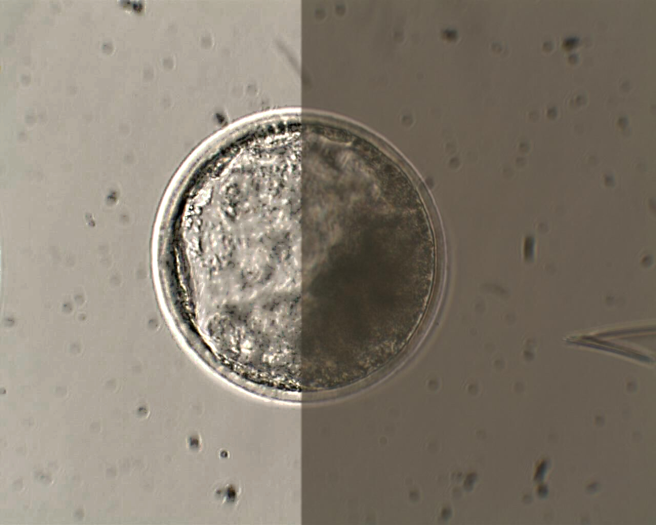
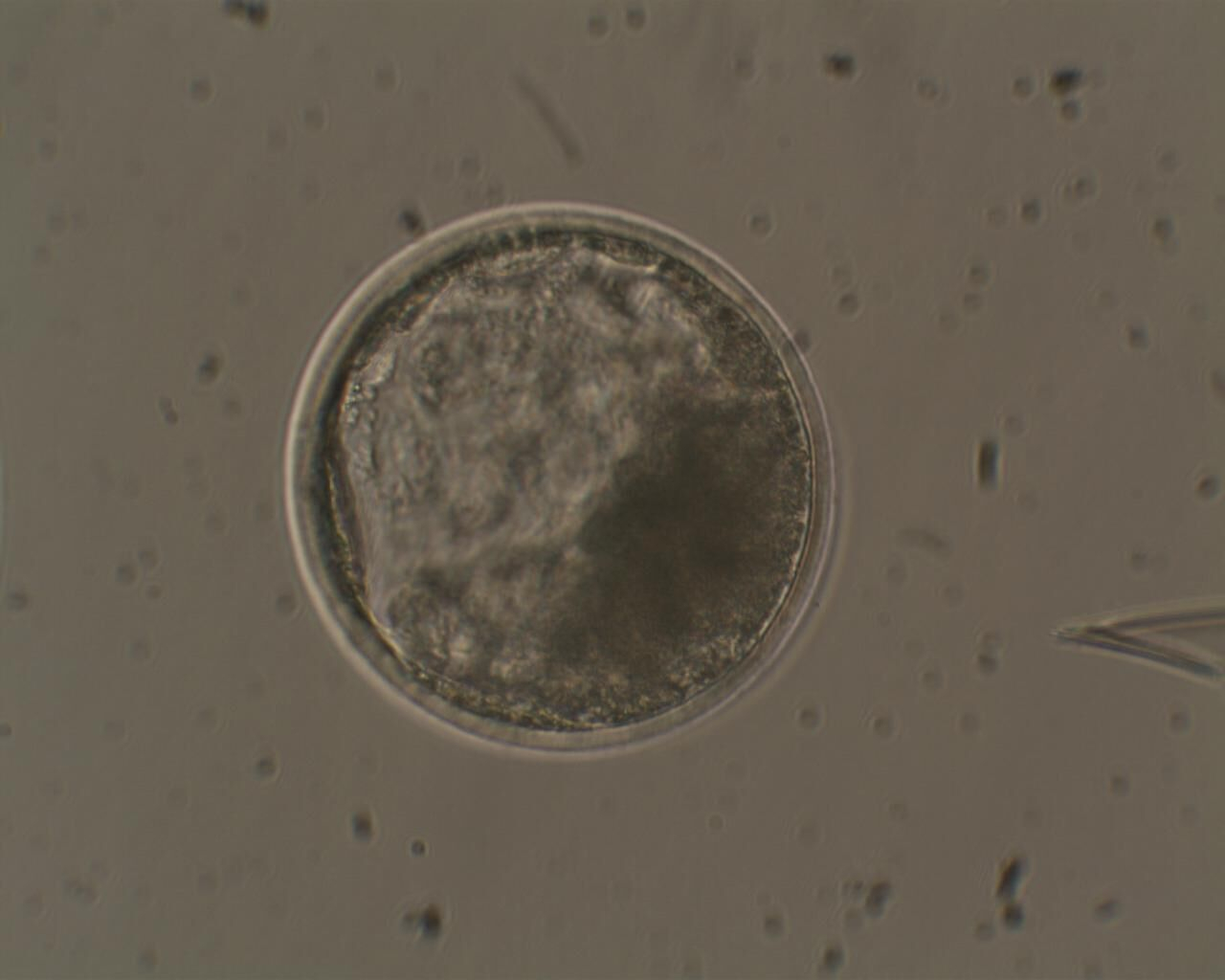
This being said, let's begin with an example. The image below is a microscopy image of a cattle blastocytst, an early stage of the embryo. We’re going to use this image as an example throughout the tutorial.
Opening the image with GIMP is easy: just go to File > Open and select your file. Dragging & dropping over the interface also does the job.
Brightness and Contrast
The first thing we can notice about our image is that it is a little bit too dark. If it were used in a presentation, it would probably be hard to see the details. The basic way to handle this is to modify brightness and contrast. These operations are accessible in the menu :Colors > Brightness-Contrast. The controls are very intuitive, and if the “preview” option is checked, you should be able to see results on the fly.
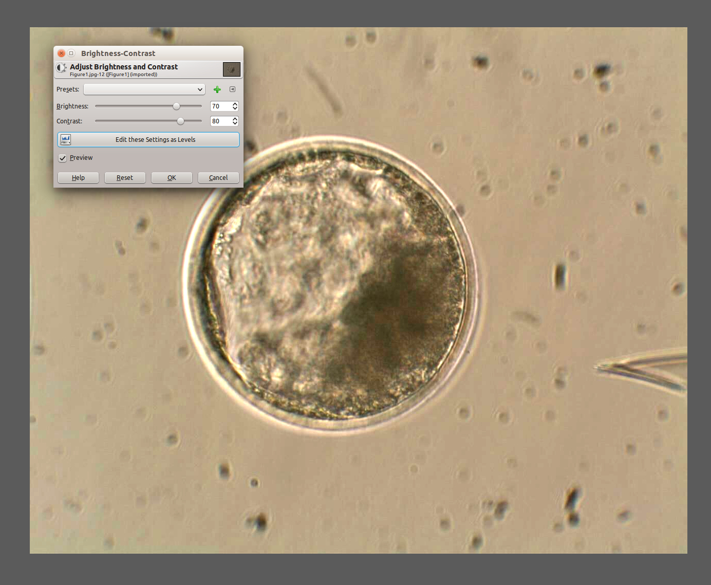
Looks much better, doesn’t it? The opposite is also possible: if an image looks too bright, you can correct it. But be aware that no process can do miracles. If the image is much too dark, it wouldn’t be possible to fix it without creating heavy noise and artifacts.
Saving the image
Now that the image looks better, you may want to save it for use in your presentation. First note the difference between “saving” and “exporting”. If you go to File > Save as, you will only get the option to use the .xcf format. This is the format used by GIMP, so that all your work can be editable. If you want to save your image as a regular image file (to be used anywhere else) you need to go File > Export As. From there you may choose from a wide range of file formats (if in doubt regarding which format to choose, check the image formats tutorial on this LibLab).
Saturation adjustment
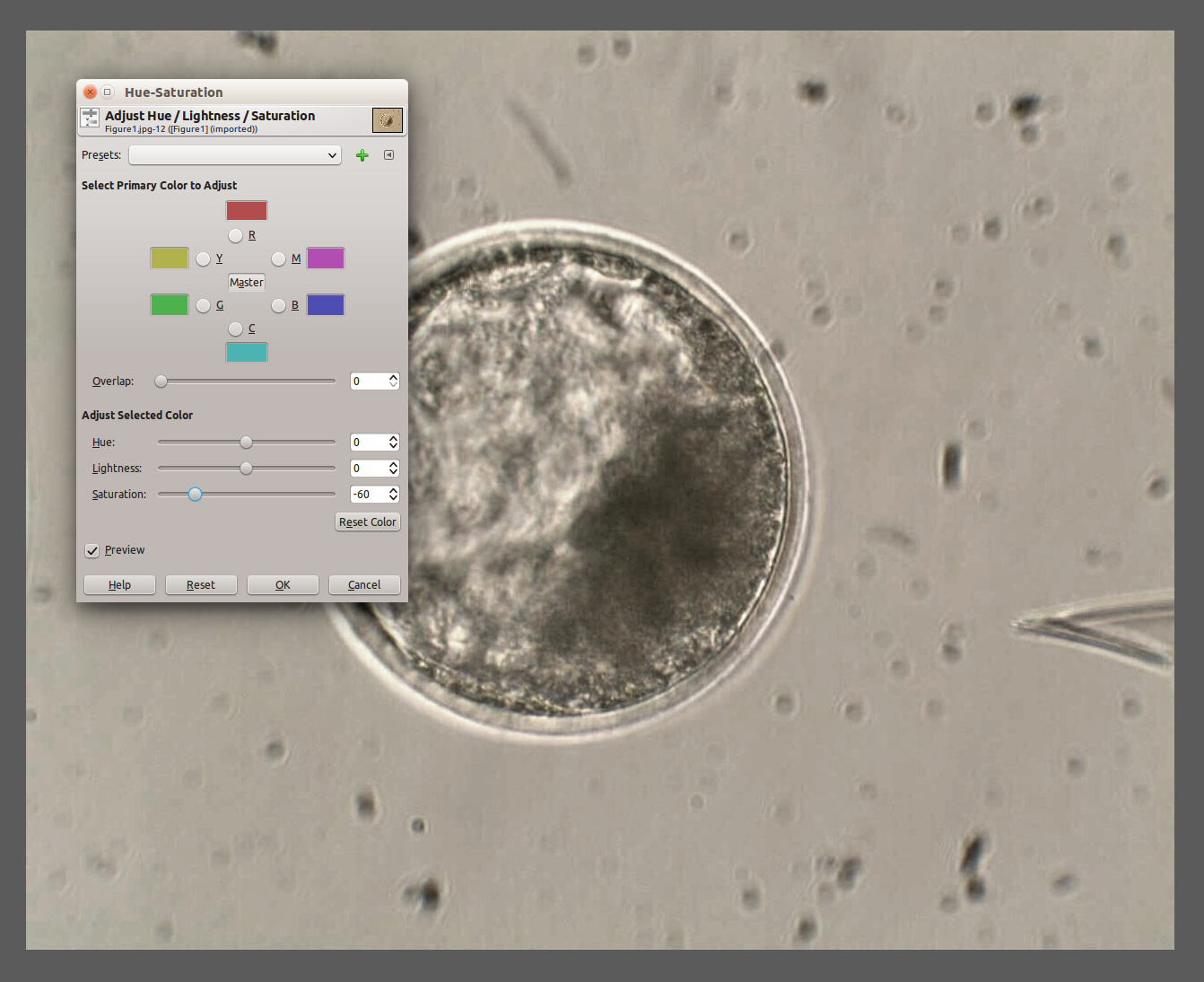
Now you may think that the image is a little bit too yellowish. As we increased the light contrast, we also increased the color contrast, making it more expressive. The way to work with this is through the Saturation tool, found here : Colors > Hue-Saturation
Increasing details on the image
Now for something a little more subtle, we may wish to increase the small details of the image, such as the cells that line the blastocyst. The tool for this is called Unsharp Mask and you can find it through Filters > Enhance > Unsharp Mask.
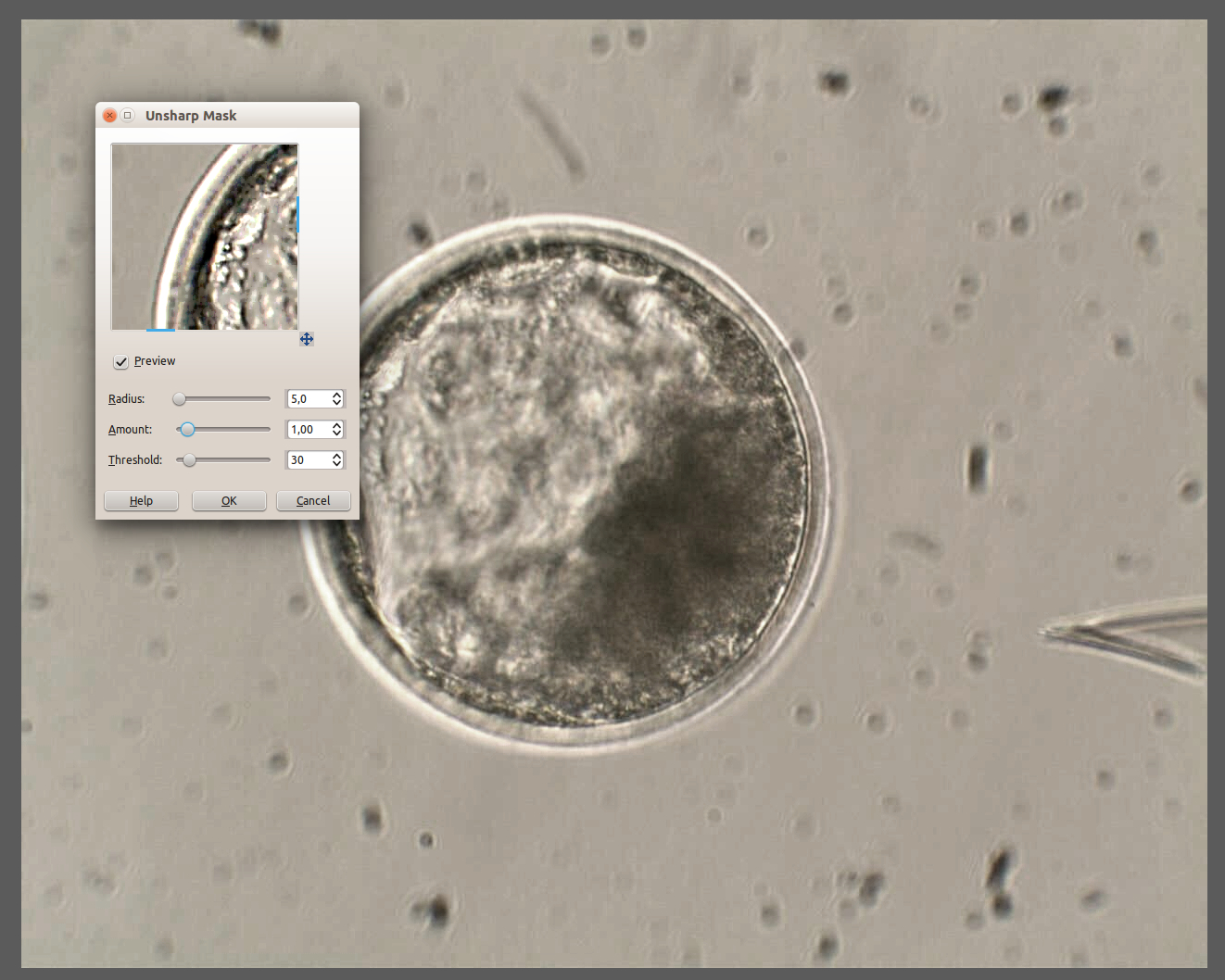
Here it’s a little bit more tricky to comprehend what's going on. First, as the operation is heavier, the preview occurs in a small window, to save time. You can move the image into this little window to test effects, and after clicking on Ok the result will be applied to the whole image. You have three sliders to adjust, and the three must be correctly tuned to have a good final result. The first one, Radius is the approximate size of the object you want to enhance, in our case the small cells. The second is Amount, which is the strength of the enhancement. The third parameter isThreshold, which you can use to choose whether the filter will be applied on the whole image or only on borders. Increase this value until you don't see much change on the background of the image, but only on the cells.
Below we can see a comparison between our treated (left) and original image (right). It is likely that the adjusted version will look much better on a presentation or poster.
