Visualizing your data : boxplots vs. bar plots
Data visualization is a recurrent problem in all domains of data-driven science.
Despite the existence of a plethora of data visualization possibilities, there is an over-prevalence of bar plots. Given that bar plots reveal precious little about the distribution of data, this type of visualization can be misleading.
A “plotting revolution” has been started by a group of young researchers at the DEC (the ENS’s Department of Cognitive Studies). The project’s goal is to communicate about the limitations of bar plots and the necessity of clear and complete data visualization.
They've created a campaign to encourage discussion about data visualization, and specifically the drawbacks of the ever-present bar plots that you can find in all scientific journals. [Read more about their project on their Kickstarter page, which explains their motivations and goals.]
Why is this such a big issue? Let’s take a look.
Boxplots vs Bar plots – points to remember:
- Histograms are the best way to see the spread of your data.
- Boxplots are the next best way.
- Bar plots are the worst way. Don’t use them.
We’ve all been there. Everyone (including myself!) has published a paper with bar plots; they are after all the most common form of data visualization in many scientific fields.
Hopefully after this demonstration, though, you will be convinced that they are an inadequate tool for representing distributions, and should be left for count data if you feel a table won’t suffice.
For this tutorial, let us picture two sets of fake data. Both of them have the same mean (100) and the same standard deviation (20), but as we’ll see they are very different in terms of their distributions.
Types of plots : Histograms
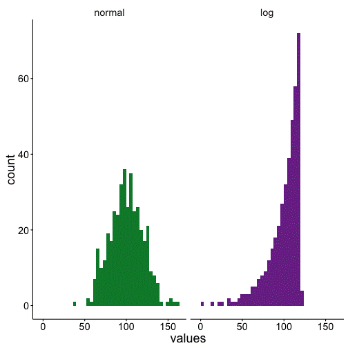
Let us first make some histograms to show that the two data sets have very different distributions. The first data set has a normal distribution, while the second one is logarithmic.

Types of plots : Boxplots
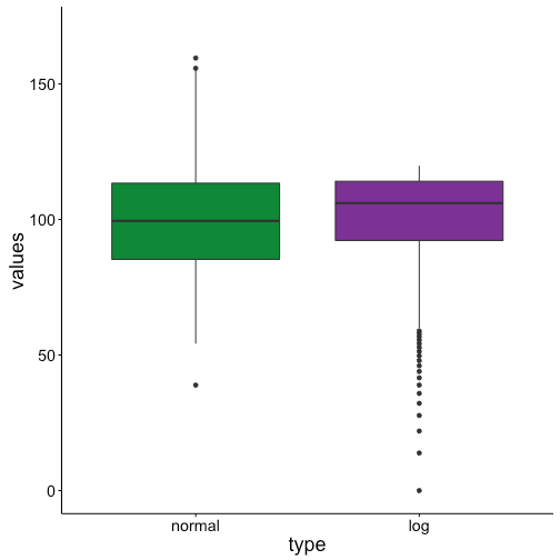
This difference can also be seen in the boxplots, although to a lesser extent. The box for the normal distribution has roughly evenly sized quartiles on either sides of the median, and only a couple outliers.
Conversely, the logarithmic data has a long left-skewed distribution, as can be seen by all of the low value outliers.

Types of plots : Bar plots
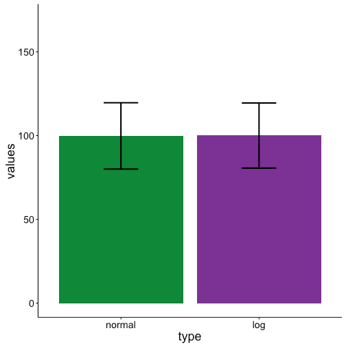
However, if we turn to bar plots, we see that they are identical! Both data sets have the same mean and standard deviation. Hence it becomes clear that bar plots completely lose the difference between the two data sets.
This can be problematic if, for instance, you want to run a statistical test to test for differences between these two groups.
Firstly, it’s a problem because many statistical tests require a normal distribution of the data, and a bar plot will not warn you that part of your data is non-normal.
Secondly, if you run a test only looking at means, you won’t be able to tell that the two groups are different in regards to distributions.

Conclusion
Whenever plotting data with a distribution, boxplots are to be preferred over bar plots.
Happy plotting!
N.B. The present demonstration was prepared using the free, open-access statistics tool R. For more information on installing and using R, check out Page Piccinini’s R course on her blog.


