Scribus (1) : Introduction
It’s inevitable that at some point, we all need as researchers to create a poster to display our work. Organizing information is fundamental and, as a result, it is crucial to use the right tools. Scribus is efficient open source software for this task. We propose a short introduction to it in this tutorial.
Scribus, the right open source tool for posters
If you ask your colleagues, you will probably learn that the vast majority of them uses PowerPoint to design posters. Although it is possible to do so, Powerpoint lacks an important number of tools that are necessary for a high-quality result! Programmes such as GIMP and Inkscape are not indicated for this task either. Posters are a specific case, for which we need to mix vector and raster graphics, to make use of good typography tools and also to pay specific attention to content display and alignment. We also need to be able to export content in high quality, print ready, PDF formats. Scribus is the open source alternative for Adobe InDesign, and is developed with all these characteristics in mind. It is often referred to as desktop publishing software, meaning that it is designed for the development of materials like magazines, newspapers, posters, books etc.
Throughout this tutorial, we will be using Scribus 1.5.1, which can be found for download on its official website. This version is labeled as “in development”, since 1.4 is the current stable release. However, several improvements and an overall good stability led us to prefer version 1.5.1.
Creating a new document
Is is crucial that you should know beforehand the dimensions of your intended image once printed. The most common standard for paper sizes is the A series. For example, A4 (210 × 297mm) is the most widespread format, and A0 (841 × 1189mm) the common size for posters. You also need to plan ahead regarding orientation (portrait or landscape).
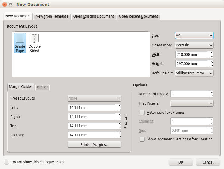
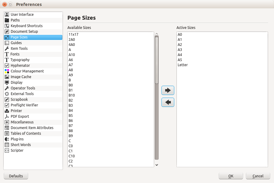
If you cannot see the standard paper sizes in the list, press cancel and then go to File > Preferences. Then choose the option “Paper sizes” and add the ones you need to the right-hand list, as shown on the image below. Thus, when creating a new document, the selected paper sizes should also be available.
For this tutorial, let’s create an A0 paper (poster size, portrait orientation).
N.B.: To zoom in and out on your document, hold Ctrl and use the mouse wheel. To activate panning, press spacebar once, and then move to the desired place. Press spacebar again to exit panning mode
Creating guides
One of the standard ways of organizing our documents is by using columns. Their use is of great importance, not only to keep everything vertically aligned, but also to make reading easier. If, on a poster, a line runs along the length of the paper, reader must also move their head while reading, not only their eyes, making reading less pleasant.
To create the guides for columns, click on Page > Manage guides. In the window that opens, go to the tab Column/Row.
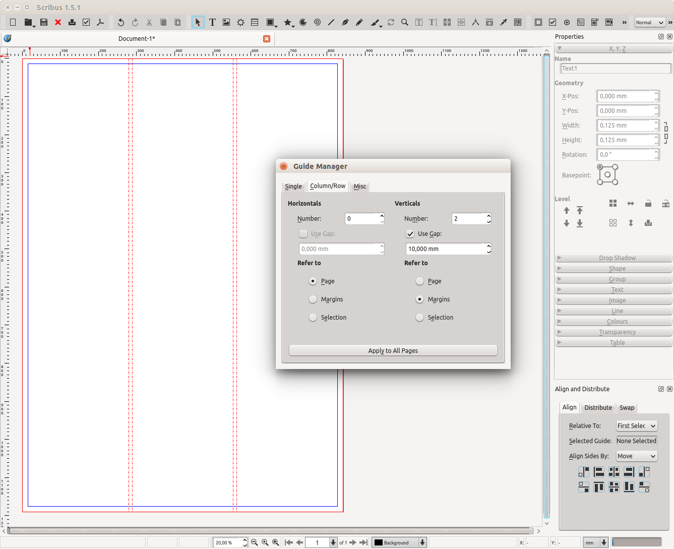
For this example, let us create three columns, meaning that we need to choose 2 vertical divisions. Also select “Use gap”, so that we have space between the columns, which will prove essential to separate contents. The size of the gap can be customized, and 10mm suffice for a poster. Finally, select “Margins” under “Refer to”, so that the columns have the same width.
Inserting text
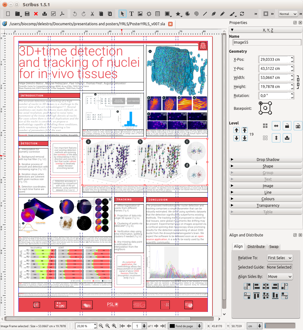
To create a new text box, go to Insert > Text frame and drag a rectangle on the desired spot. Notice that the box will snap to the guide lines, helping you to keep everything aligned and in place. If the snap does not happen, click Page > Snap to guides.
Let us first create a big box spanning two columns at the top of the page, for the title. Afterwards, we can add smaller boxes of text, using the first two columns. We will be using content from the PSL-Explore website throughout this example.
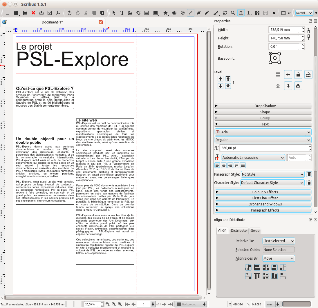
Format options such as font type and size are located in the "properties" window. If the window is not visible, go to Window > Properties.
It is important to note that we can choose between three options for spacing: Fixed Linespacing, Automatic Linespacing and Align to Baseline Grid. The automatic mode will give the standard distance between lines (proportional to the font size). "Fixed Linespacing" allows you to you choose the space you desire, wich can be really helpful when the font size is too big (as in titles) and the space between lines tends to get too large. "Align to baseline" is to be used when we need to match alignment between different text boxes.

N.B.: To preview your document (hide all guidelines) you just need to press Ctrl+Alt+P. Press the same keys again to come back to editing mode.
Inserting images
If you have ever tried to place an image in an exact position inside a Word document, you know it can be quite a frustrating experience. The way images work in a Scribus document is completely different, so the same problem will not arise : the image will appear exactly where we want it ! Each image is linked to a frame, hence the first step is to insert one, by clicking Insert > Image Frame and then creating a rectangle of the desired size.
When the frame is in place, right-click on it and go to Content > Get Image. In the window that opens, choose the image file you want. You will notice that Image and Frame are two distinct instances. To move the image inside the frame, double-click on it so that the image itself is enabled, then just drag the image to the desired position within the frame. Note that the image cannot “escape” the frame! If you want the image in another position in your document, you can move the whole frame (and the image inside it will follow along). This system allows fine adjustments as far as composition goes, while keeping everything in place.
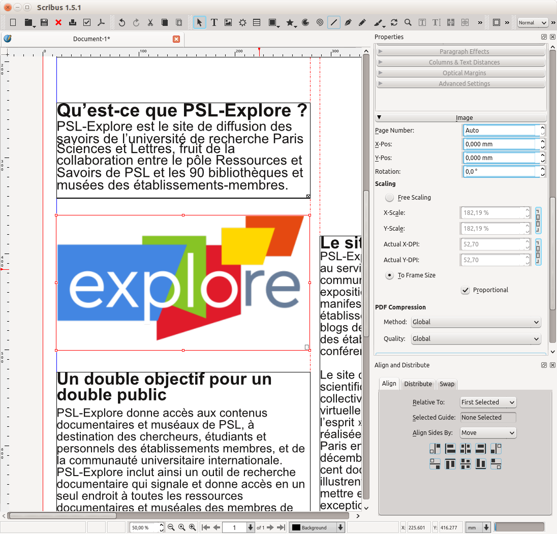
You can also automatically adjust the image size to the frame size, by right-clicking on the frame and going to Image > Adjust Image to Frame.
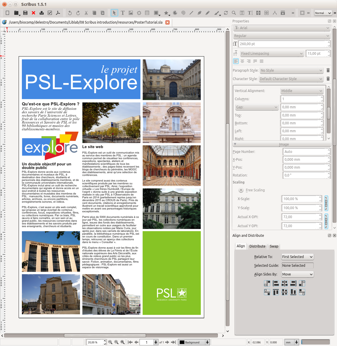
In the "properties" window of the image frame, it is possible to adjust size. If the image is bigger than the frame, it will appear cropped. This is a nice option if you want to create a grid of images with the same size even if the source images have different ratios, as shown below.
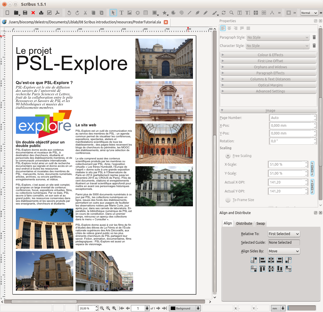
Adjusting content into a regular grid is a good way to make your poster more organized! You can enable the snap between objects by going to Page > Snap to items. Also, remember to use the alignment tools (Windows > Align and distribute), they work just like on Inkscape. If in doubt, check this tutorial!
Adding colors
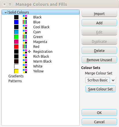
You may have noticed that in the "properties" menu, it is also possible to change the color of objects. However, only a few options are enabled by default. To use new colors you need to add them to the palette. To do so, go to Edit > Colours and Fills. In the window that opens, click on “solid colors” and “Add”. Choose a color, give it a name and it will then appear when choosing color from the "properties" menu.
Adding simple shapes
Common shapes, like rectangles, circles, stars etc. can also be inserted to your composition. Just go to Insert > Shape and choose the one you need. Rectangles are always useful as separators or as background for text !
