
Adjusting plots with Inkscape
Graphs in general are a wonderful way to display data. They can help us to quickly analyse patterns and to understand our numbers at a glance. Even better than having good results is displaying them nicely!
Using Libreoffice Calc for plots
As we saw before, Libreoffice Calc is a common free alternative for Microsoft Excel, and a good way to start working on our data. It differs very little from Excel, so you should feel at home after a few minutes. To start our tutorial, let us use a small dataset and generate a simple scatter plot with connected lines, as seen below.
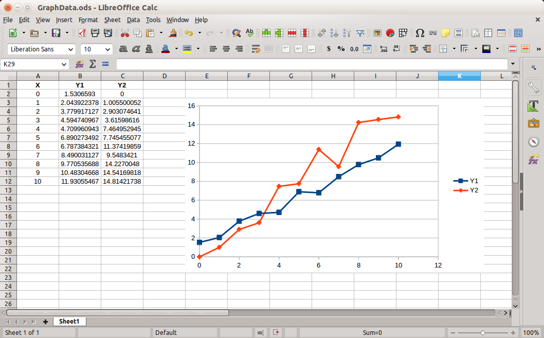
N.B. If you want to generate something similar (without manually typing all the numbers), the formulas used where “=A2+2*RAND()” on B2 and “=A2+RAND()*A2” on C2. To generate the graph, select the data, and then go to Insert > Chart.
As on Excel, you can start adjusting your plot directly on Libreoffice. However, if we want to take it one step further, we can really obtain any aspect we could imagine. For this, neither Excel nor Calc would suffice, as we would always be constrained by their editing capabilities. But we can easily export our plots to Inkscape, and unleash all the potential of vector editing!
Inkscape for editing plots
The first step is to export our graph from Libreoffice in a vector format. To do this, right-click on it and select “Export as Image”. Make sure to check SVG - Scalabe Vector Graphics.
One of the main things to remember in this tutorial is always to export your figures in vector format! If you’re not aware of all the advantages that this brings, take a look at our tutorial on image formats.
Now that our graph is saved in SVG format, it is time to load it on Inkscape. As we are now working with vectors, notice that it’s possible to zoom limitlessly without losing resolution!
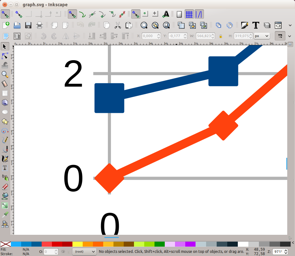
Let us begin now with the modifications. The figure is composed of several objects grouped together. We have two options to access the individual objects: 1) Right-click on the group and select “ungroup” or 2) Double-click on the group to work “inside” the group. Double-clicking again outside (in a blank area of the page) makes you leave the group.
One of the problems of the standard plots (both from Excel or Libreoffice Calc) is that usually they have unnecessary guides, that don’t really contribute to a better understanding of the data. The horizontal and vertical guides are only important if we want someone to follow the lines in order to check a value. For the sole purpose of checking the trend of the lines, we don’t need them. A common rule of thumb for a clean composition is that if you don’t need something, don’t show it. While deleting the lines, you may also notice that there is a big white object serving as background for the image; it can also be deleted.
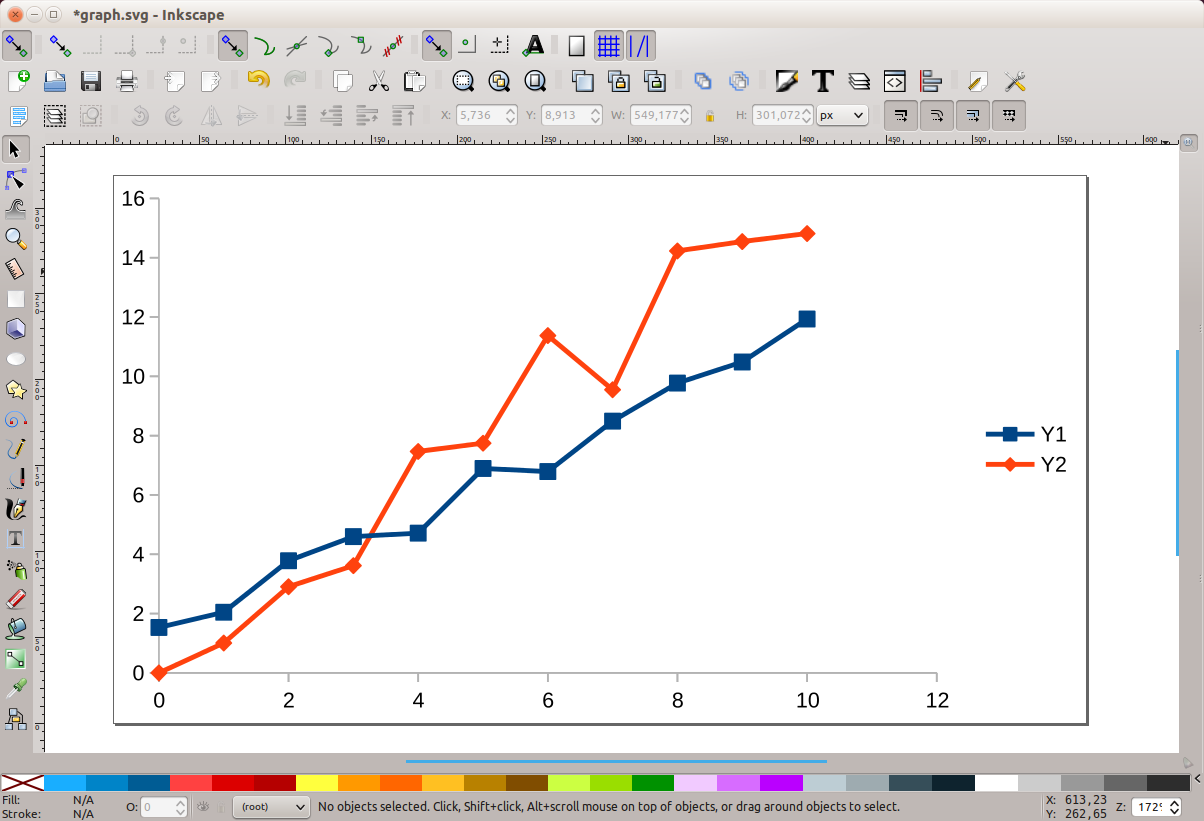
Next thing we may fix is the horizontal axis, which goes up to the value 12, although the data stops at 10. Just delete the number 12 and the small tick, and reduce the size of the line to match the end of the number 10 tick. Beforehand, make sure that you have not selected the option to scale the stroke together with the object (button shown on the image below, if you cannot see it, go to View > Show/Hide > Tool controls bar). Otherwise, the line will get thinner as you reduce its horizontal size, and we don’t want that.

Also, make sure to enable the snapping of objects (the shortcut is “%”). This way, it becomes easier to match the position of different objects using the edges.
You will notice that there are two identical lines forming the horizontal axis. We only need one, hence the second one can be deleted. Our graph should resemble the image below.
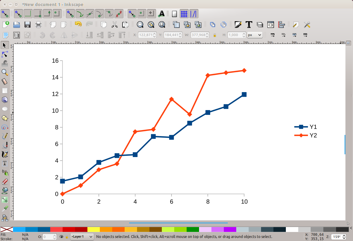
Now let us delete all the data markers that came as default. The fastest way to do this is to select one and then go to Edit > Select Same > Fill and Stroke. Then all the objects that have the same properties will be selected and can be deleted by pressing “del” on the keyboard. You may need to repeat this, since Libreoffice Calc may generate duplicates of the objects when exporting the .svg file.
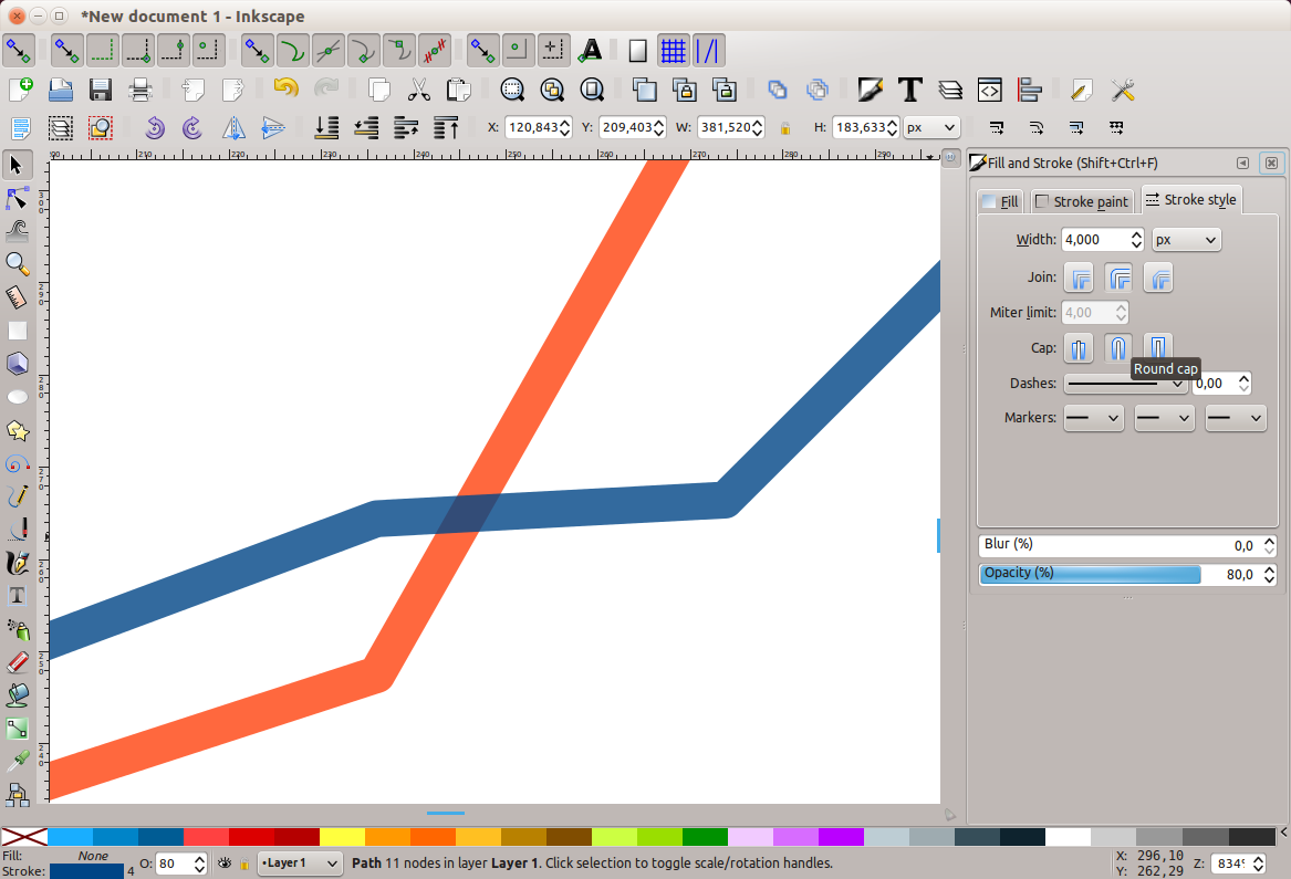
We may now change the properties of each line independently. Select the two lines of the graph and set the width to 4px, then enable the rounded cap and set opacity to 80%. Opacity is a nice trick to make the intersection of the lines appear more natural, as seen below. Repeat the same procedure for the lines on the legend, and move them under the plot.
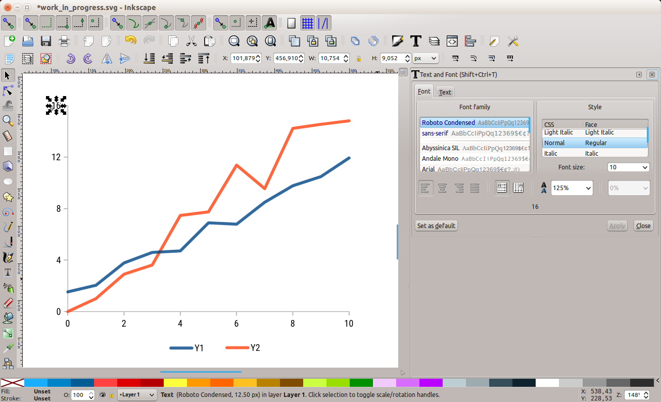
Another point that should receive a good amount of attention is the typography used on our plots. A good idea may be to use condensed fonts, such as Roboto condensed for example. Condensed fonts use less horizontal space, making it possible to have a more dense set of numbers, with more space between them. Be aware that when you change the font for the first time you need to manually set the font size, otherwise it will be really small. To make things just a little cleaner, we could also delete the odd numbers on the vertical axis, as we don’t need all of them. The result should resemble the image below:
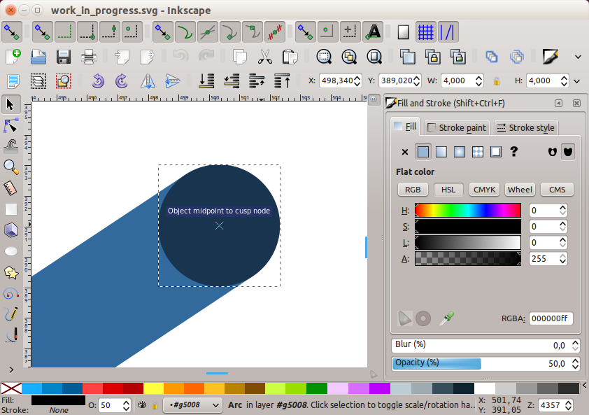
It is possible to add some data markers that are more subtle than the standard ones from Libreoffice Calc. To do this, create a circle with a width of 4px (the same we used for the lines). Choose the color black and an opacity level of 50%. With the “snap to objects” option activated, it will be easy to align the center of the circle with the nodes of the line, just by checking the “Object midpoint to cusp node” message, as depicted on the figure below.
Make copies of the circle and center it on every node of the two lines (This should be quick with a copy/paste approach. Note that the object is pasted where the cursor is currently pointing). As the circle object is partially transparent, the result will be slightly blue or orange, depending on the line.
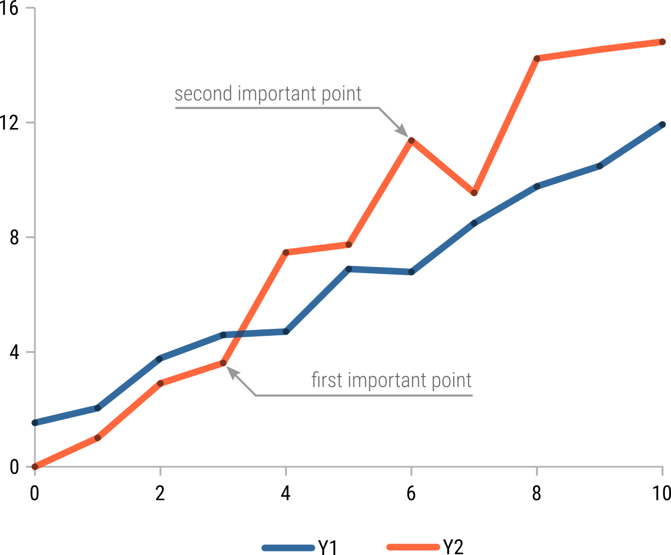
Our graph already looks much cleaner and modern! You can also follow the instructions from our last Inkscape tutorial to add some annotation to key points on the graph. The final result should look similar to the one below:
Happy plotting!

