Working with layers on GIMP
If you need to create a composition with two or more images, you’re going to need to better understand the concept of layers. In this tutorial we explore the GIMP layer system through a practical example.
You can picture layers as independent sheets of paper, all piled up on top of each other. This implies that effects can be applied independently to each layer, which can turn out very handy, as we will see throughout the tutorial. Just keep in mind that you cannot see through the layers, unless they are transparent - as with a paper pile.
Starting with an example
Let’s turn to the two graphs below. What if you needed to merge them in the same image for your publication?
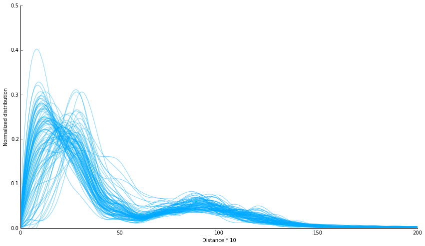
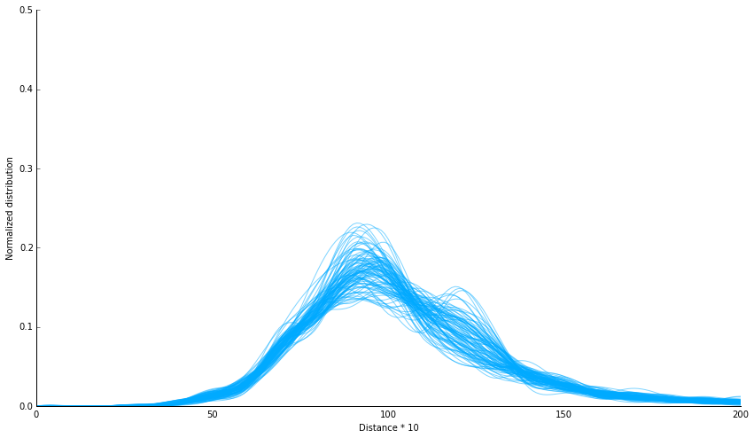
As they have exactly the same axis, it should suffice to add one on top of the other. Open your GIMP and drag both onto your interface.
N.B. Remember you can download the images from this tutorial and try it yourself!
Layer order and visibility
If you have dragged the files to your interface one after the other, you have noticed that, when opening the second one, the first one “disappears”. What really happens is that the second one is superimposed onto the first one, which you can see in the “layers” window, as shown below.
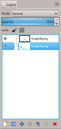
N.B. If you do not see a “layers” window opened, go to Windows > Dockable Dialogs > Layers.
The images are drawn on the screen in a top-to-bottom order. This means that we cannot see “Graph A” because “Graph B” is on top of it. Note that the background of each image is white, and not transparent.
You can easily alter the order of the layers by dragging them up or down inside the “layers” window, or by selecting the layer and using the “up” and “down” arrow icons at the bottom of the window. You can also turn on (or off) the visibility of a given layer by clicking on the small eye icon to the left of it. To delete all the content of a layer, select it and then click on the red “x” icon.
N.B. Remember that everything that you do on GIMP will be applied to the selected layer! You should always check whether you are applying your effects to the right image.
Color to transparency
We have seen that superimposing the two images implies that we cannot see both at the same time. However, if the background from Graph B (on top) was transparent, we would be able to see through it, although the lines would remain visible.
To do this, select the layer and then go to Layer > Transparency > Color to Alpha. Within the image editing jargon, “alpha” refers to the “alpha channel” of an image, which controls the transparency level of the pixels.
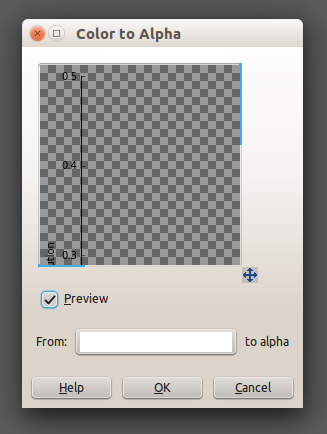
In the “Color to Alpha” window, choose a color that will be considered as transparent. It doesn’t need to be white, it can be any color. To choose, click on the rectangle between “From:” and “to alpha”. Inside the preview window you can check whether you obtain the desired result. Click OK to apply the transparency. You will notice that the white from Graph B has become transparent, which makes it possible to see the lines from both graphs at the same time!
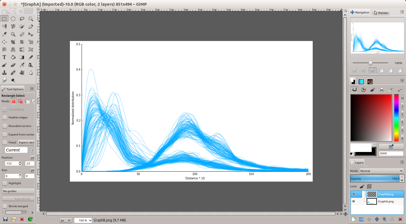
Repeat the same operation, this time choosing the color black, so that the axis from Graph B also becomes transparent. Note that in the layers window, the preview of Graph B now displays a checkboard pattern, which symbolizes transparency.
Changing the colors
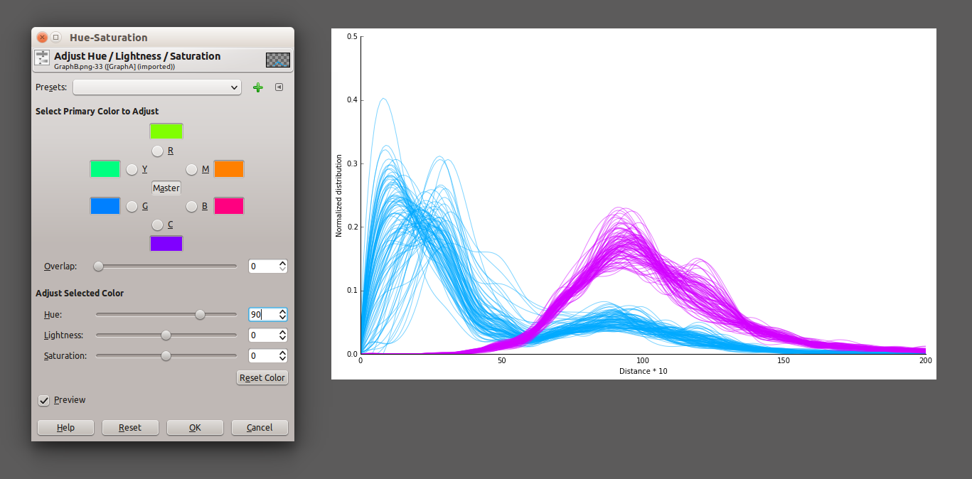
Now that we can see both graphs, it would be nice to work on color. If we change the color for the lines of Graph B, it makes it easier to distinguish between A and B. To do this, select the layer and go to Colors > Hue-Saturation. In the window that opens, change the “Hue” value (you can choose an angle between 0 and 360 on the chromatic disk). With the “Preview” option checked, you should be able to see the changes right away. After selecting the desired color, click “OK”.
Layer global transparency
Now to more subtle detail : how to make both sets of curves look more integrated? Notice that where the curves overlap, the pink curves from Graph B are on top of the blue ones from Graph A. We can slightly decrease the opacity of Graph B to make it a little more transparent. To achieve this, select the layer and adjust the Opacity level to around 70%.
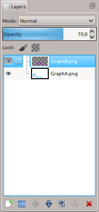
You should now be able to see through the pink lines, thus giving the impression that they are more integrated with the blue ones.
Final result
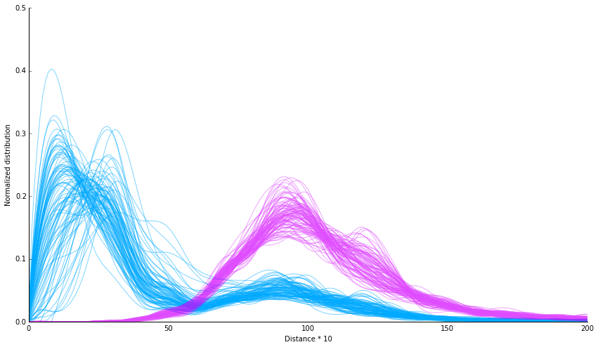
The image is now ready to be exported, and to be used in your paper and/or presentation!


